On Top Form
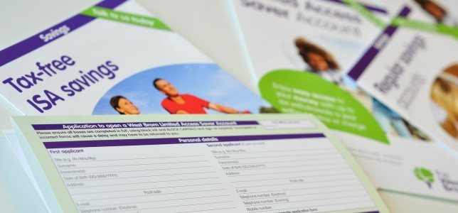
Thanks to the customer panel, our latest application form is simple to use and understand.
We love hearing customers’ opinions on a wide range of topics through the customer panel, but where it can prove particularly useful is testing out new ideas and procedures before they go live across the Society.
In this exercise our panel members reviewed an updated version of our savings application form so that we could gather feedback on its design, layout and user-friendliness.
While much of what had been created was well received by testers, their comments did include some very helpful suggestions for refinements which have since been carried through to the final document.
First impressions
We asked panel members to look at a copy of the application form and describe their initial thoughts. Respondents were largely positive, agreeing the form was straightforward, clear, logically ordered and well laid out.
Only a small number (8%) found the prospect of filling out the form daunting and even fewer (3%) thought it was confusing. Additional comments referred to the font size being a bit small and some of the wording somewhat confusing, points which we have since been able to address.
Completing the form didn’t seem to pose many problems – 84% of the group felt ‘very confident’ or ‘fairly confident’ they could do it.
Section by section
As part of the survey, panel members were invited to review specific sections of the application form, comment on the layout and identify any areas for improvement.
There was general agreement that sections were clear, straightforward and easy to complete, but some parts didn’t work so well and could be better presented. Here are some examples of things we decided to change in the final form based on suggestions from the panel:
- Increase the size of the boxes for people to write in
- Add extra options for an applicant’s title, such as Dr or Rev
- Remove any jargon or technical language
- Tweak the order of some of the questions on the form to improve the flow
How this helps us
The revised form is now being used both in West Brom branches and on our website.
Verity Coton-Matthews, Marketing Communications Manager for the Society, said: “It’s important to take the time to get documentation like this right and letting the panel have sight of an early draft meant that any minor issues could quickly be sorted out.
“Customers benefit by having a form that isn’t confusing or time consuming to complete, plus it reduces the chance of incorrect information being sent to us that later needs rectifying.”
Finding exactly what you want
An additional question in this survey related to our browser walls, which can be found in every West Brom branch to showcase product information and news about your Society. They also house the aforementioned application form, with copies attached to all savings account leaflets.
Introduced when we refurbished all our branches a few years ago, the layout of the browser walls and how literature is arranged needed reviewing, as Verity explains.
“The browser wall is a handy resource, but only gets used properly if the information is clearly displayed and kept fully up to date,” she said.
“We were starting to find inconsistences across branches, whereas what we really want is for customers to have access to the same information irrespective of where they choose to carry out their business with us.”
Enter the customer panel to cast their opinion on which wall design we should opt for and offer their reasons why.
“The style we agreed on is very clean and easy to read, but still colourful in order to grab people’s attention,” said Verity.
“The updated browser walls are a welcome addition to our 37 branches and once again we offer our thanks to panel members for their insight and helpful suggestions.”
Contact the Media Centre
To find out more information on any of the news articles featured in this site, please get in touch with:
Email: pr@westbrom.co.uk